Here’s a list that’s sleek and streamlined. It says just what it needs to say and nothing more.
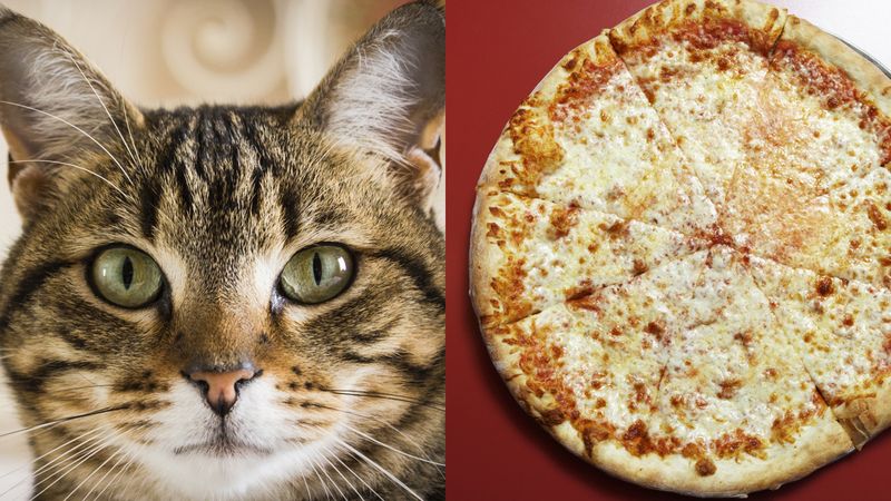
1. Cat

2. Pizza

Wow. Incredible!
What a triumph of minimalist design! Too many websites believe they can pack their lists full of photos and appeal to people through quantity rather than quality. Instead, you were treated to just the two images you needed to see, without any of the usual dross and padding.
We hope other content creators on the web will start to emulate this list’s beautifully sparse design, and realize that less can sometimes be freeing from the burden of more. Bravo!


