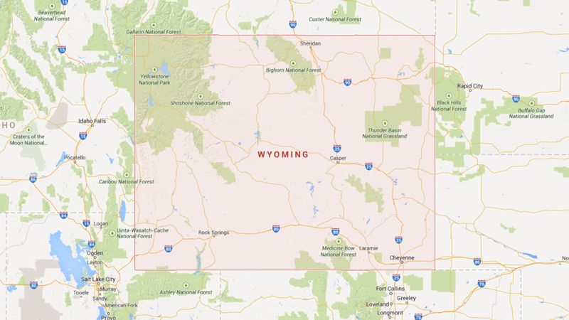
Sometimes you have to see something to believe it. But how do we see information? That’s a question the smart folks over at MapStats tackle on a daily basis. The innovative data visualization group creates dynamic graphic representations of statistical information, so that we really can believe things by seeing them.
Their most recent creation? This totally eye-opening map that shows how often the residents of every U.S. state say “Wyoming.”
Check it out below, and prepare to see the country in an entirely new light:

Thought-provoking, right? You’ve probably seen a map of the U.S. before. But you’ve never seen one that actually tells you which states have the highest (and lowest) average rates at which residents utter the word “Wyoming.” It’s like looking at a completely different country!
What is immediately clear from this map is that residents of Wyoming definitely say “Wyoming” the most. That makes sense, seeing as they live in Wyoming.
But the most shocking takeaway is that North Carolina residents actually say “Wyoming” at the lowest rate. On average, Tar Heels only say “Wyoming” once every eight to 10 months. That’s basically once a year! And a big drop-off from the rate at which residents of border state South Carolina say it (approx. 30 times every three to four weeks.) This tells us a LOT about this state and the polarization of the country in general.
Absolutely fascinating. It just goes to show how dynamic visualizations like this one can completely change the way you see the world.


