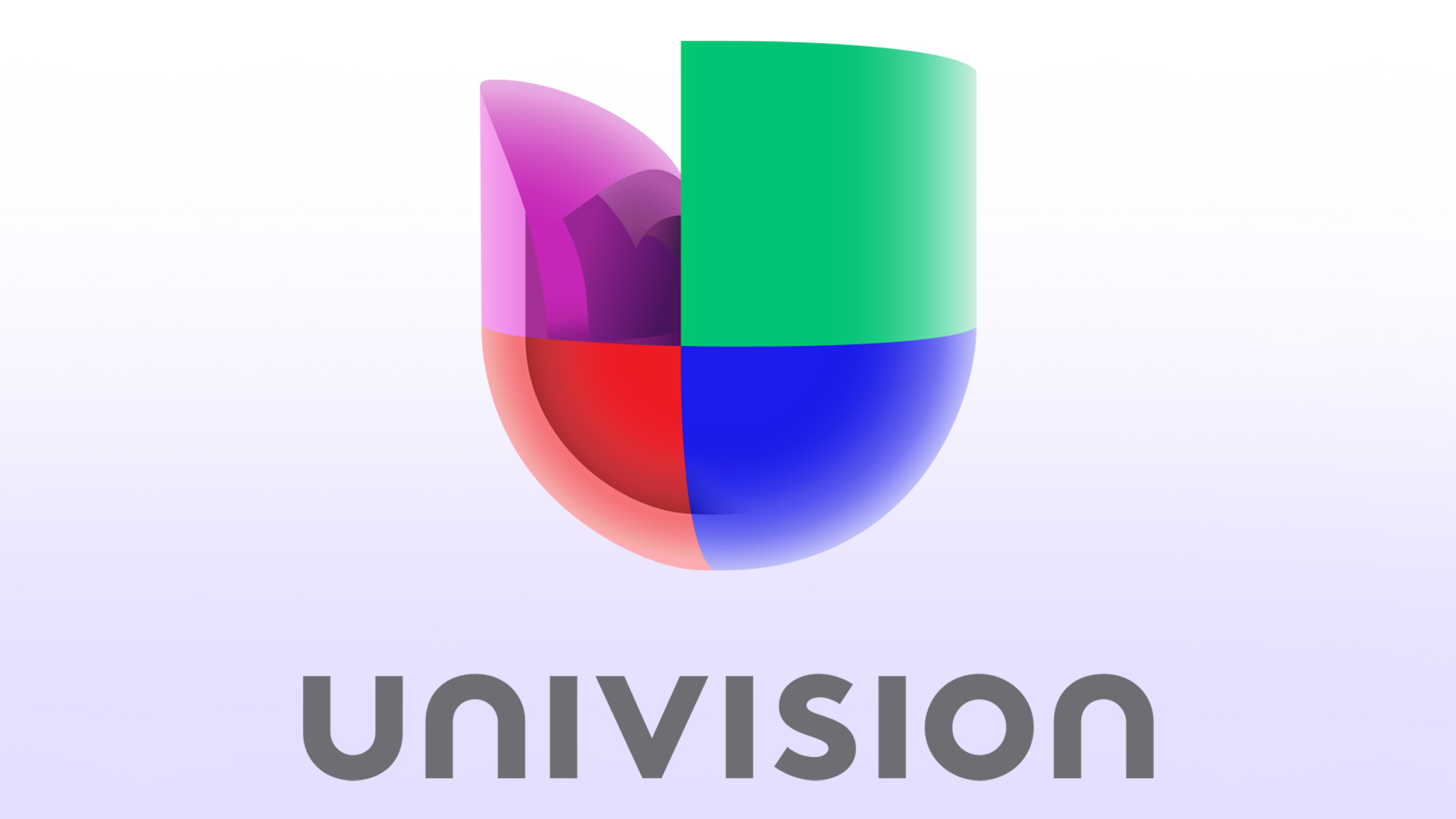
For the past three years, we’ve been under the ownership of the Spanish-language media conglomerate Univision. During that time, we have been nothing but dutiful and respectful to our corporate owners, resisting any and all temptation to criticize them publicly, no matter how badly we wanted to speak up. Yesterday, however, it was announced that Univision had sold us to a private equity firm, which means we’re finally free to speak our minds. And if there’s one thing we’d like to say about Univision, it’s this: Their logo is goofy as fuck.
It’s a real stinker, folks!
After constantly seeing their dumbass logo on company emails and documents over the past few years, we’ve come to assume that it’s meant to be a stylized rendering of the letter U, but one will notice that it is a very weird and bad-looking U. The purple part of the U, for instance, is limp and deflated in a way that is not typical of the letter U, and it’s unclear why this is the case—it certainly does not look cool. It’s also unclear is why the logo is divided into four colorful sections, and what each of the colors is meant to represent. The red is obvious (blood of Christ), but what about the other colors? It is frustrating not knowing, and, honestly, just a plain letter U in Times New Roman would be much more effective than whatever the hell Univision was going for here.
From the way the U in the logo is filled in, you get the sense Univision was trying to make it look like a shield or a badge of sorts, but there isn’t enough detail to provide any certainty on what it’s actually supposed to be. By not committing to anything definitive, they’ve teed it up for crass interpretation, giving the sneering no-goodniks of the world an open invitation to make such base assessments as, “It looks like if the Windows logo had an 80-pound tumor growing on the inside,” or ,“It resembles a urinal from the future.” While under Univision’s ownership, we were greatly distressed by how bland and asinine the logo looked but were always forced to bite our tongues, and it’s incredibly refreshing to finally be able to say, without fear of reprisal, that it is a stupid logo that only a moron could like.
Good logos should speak for themselves. You look at the NBC peacock and you immediately think NBC, but you look at the Univision logo and just become sad and confused about what the fuck it is. They helpfully added the word “Univision” underneath in boring-ass gray text for clarity, but that shouldn’t be necessary. You should be able to look at the logo and say, “Ah, yes, Univision, the channel that airs telenovelas all day and for some reason owned The Onion.”
Univision doesn’t own us anymore, so we don’t owe them anything, but we’ll do a little bit more work for them free of charge. Here are some ideas for better logos that they’re welcome to use if they ever pull their heads out of their asses:
The letter U inside a TV, conveying a theme of television
The letter U with an eyeball in it, conveying a theme of using one’s eyes to watch television
Planet Earth with the letter U on it
The letter U with planet Earth inside of it
The word “Univision,” but in a badass bold font that doesn’t fuck around
A nude Herculean man lifting the word “Univision” high over his head, conveying a theme of UNIVISION = STRONG
All of these logo options would look awesome and would make people fucking pumped about Univision, unlike their current aseptic and impotent design, which bores people to the point where they want to take their own lives. Hopefully, Univision will take our advice and consider changing their logo to something that doesn’t totally suck chode, but since our financial wellbeing is no longer intertwined with theirs, we really don’t care either way.
Farewell, Univision! Sorry things didn’t work out and we had to get a divorce.


