Some statistics can be so unbelievable, or deal with concepts so vast, that it’s impossible to wrap our heads around them. The human mind can only do so much to visualize an abstract idea, and often misses much of its impact in the translation. Sometimes you just need to step back and take a good, long look for yourself.
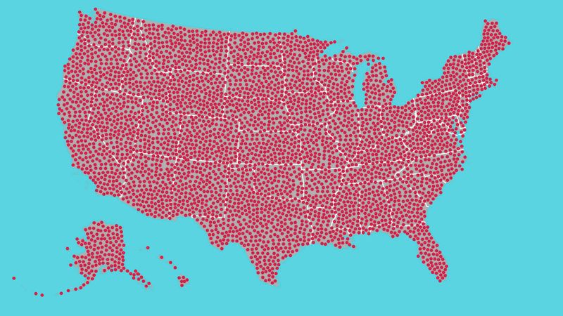
That’s why we just put 700 red dots on a map.
The dots don’t represent anything in particular, nor is their number and placement indicative of any kind of data. But when you’re looking at them, all spread out on a map of the United States like that—it’s hard not to be a little blown away.
Seven hundred of them. Seven hundred dots. That’s more than 500 dots—well on the way to 1,000. That could represent 700 people, or crime scenes, or cities. Or something that happens in this country every 20 seconds. These dots could potentially be anything—they’re red dots, so they could definitely mean something bad.
Whatever they might be, there’s no unseeing these dots.
We as a nation have problems that we must face head-on. Visualizing them might be the first step in tackling them before it’s too late. Now that we have such a potent image of 700 red dots on a map, only one question remains: Where do we go from here?
You tell us.


