We live in an era of tremendous economic inequality, and while most Americans are aware of this to some degree, it can be difficult to grasp just how devastating of a problem it truly is. To help you visualize the full scope of the issue and how it manifests itself in everyday life, here are three striking charts that reveal just how much richer someone with $6.5 billion is in comparison to someone who only has $6 billion.
As you can see here, there’s an immense difference in quality of life between those having $6.5 billion and those having just $6 billion:

Imagine if both people tried to buy castles that cost $500 million each. As this graph clearly shows, a person with $6 billion could only afford 12 castles while someone with $6.5 billion could afford 13 castles. If each castle contains 20 chandeliers, then someone with $6.5 billion would own 20 more chandeliers than someone with just $6 billion! Sounds pretty unfair when you put it that way, doesn’t it?

Another way to visualize their difference in net worth is to imagine both people standing on piles of all their money. A pile that contains $6.5 billion would be taller than a pile that contains only $6 billion, which would allow a person on top of that pile to have a better view of a bird flying overhead. In a society where wealth equals power and opportunity, that’s an extraordinary advantage.

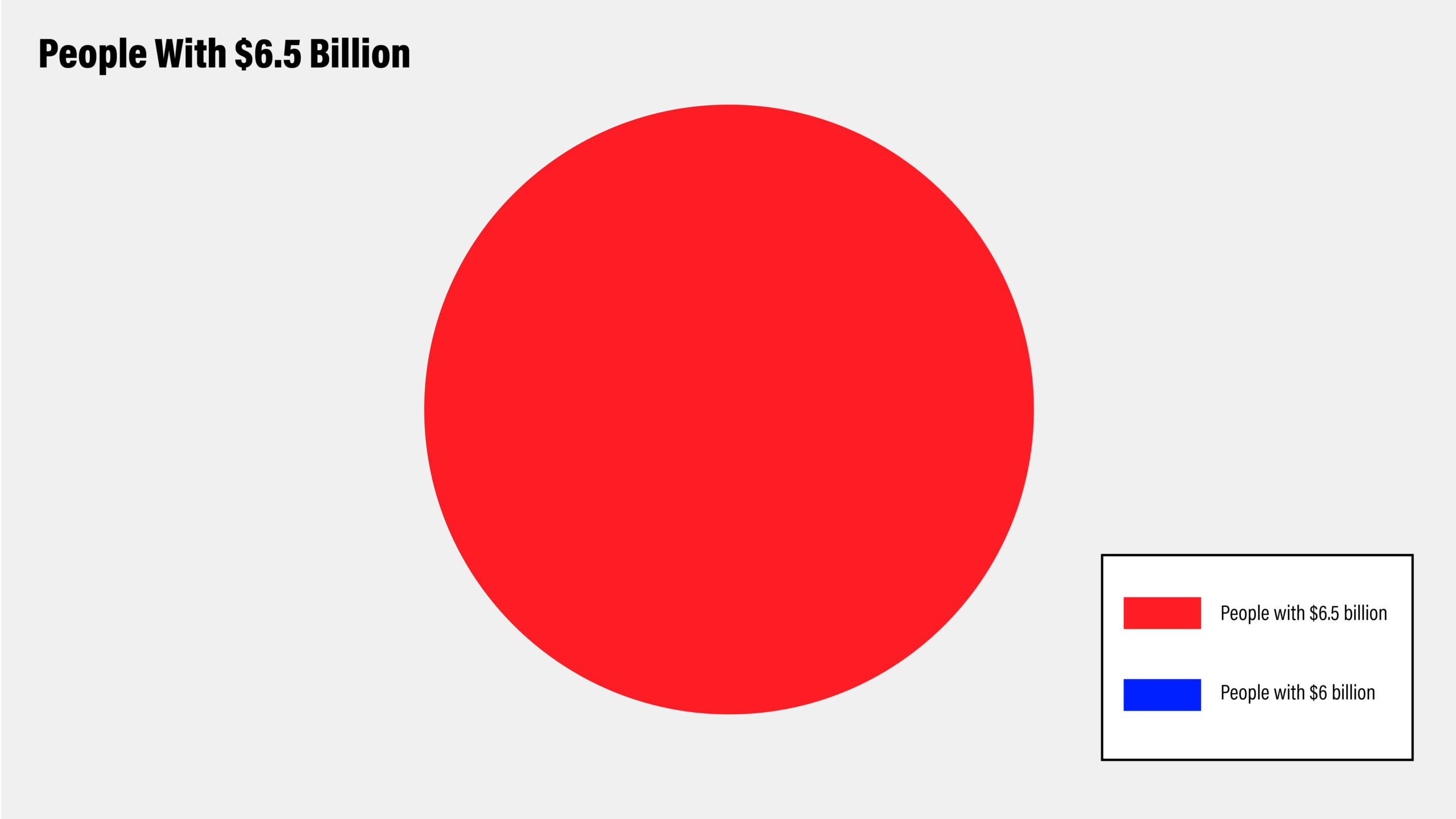
The disparity is even more appalling when you consider this pie chart, which shows that 100 percent of people with $6.5 billion are people with $6.5 billion. How many people with just $6 billion made the cut? Zero.
Yep, just let that sink in. It’s really that bad.
Although there are no clear answers on how to solve income inequality in America, these charts give us a much better understanding of our nation’s incredibly unjust imbalance of wealth and why it so urgently needs to be addressed. People with $6 billion deserve better.


